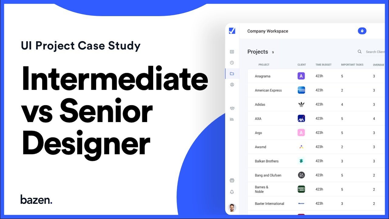

User Interface Design Project Case Study
If you wonder…How to improve your design? How to scale your design skills? How to improve UI design? Tricks for the better dashboard?
Today we’re starting a new show called UI Workshop where we go deep in our projects and we analyse how can we improve the UI design.
In this video, our CEO Stefan Tosic is challenging and reviewing the design solution of our designer Tajana. He is going to give feedback and show examples of improved versions.
Episode Breakdown:
– Too much space
– Sort by Button
– Alignment of the button text
– Avatars
– Avatars look
– Presenting information in the design
– Alignment of avatars with the label
– A lot of different greys in the text
– Colors
– Typography problem
– Lower readability
– Columns height
– Icon alignement
– Useful Shortcuts
Follow us:
https://www.instagram.com/bazen.agency/ https://www.linkedin.com/company/baze… https://facebook.com/bazen.agency Check out our work: https://dribbble.com/bazen
Visit our website: https://www.bazen.agency
👉Subscribe: https://www.youtube.com/channel/UCnqg
Source. First Published on YouTube
Growth Hacking Articles
ty Concerns ## **Introduction** The rapid development of digital twins and artificial intelligence (AI) is…
Most musicians struggle with social media. They post sporadically, chase trends, and hope for virality.…
𝗘𝗮𝗿𝗻𝗲𝗱 𝗠𝗲𝗱𝗶𝗮: The Free Marketing '𝗠𝗶𝗿𝗮𝗰𝗹𝗲' you should try to leverage. Unlike paid ads, you…
How I reuse my LinkedIn content on other networks using Buffer, X and Make com…
HOOK: Tired of spending hours searching for the pe
Hook: Are you tired of using the same old generic